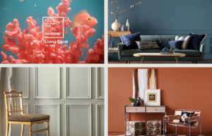
Maximize the sale price of your home! Paint can make a BIG difference whether your home looks new, stylish and chic – or old and outdated. If you’re not sure where to start or need expert staging tips, call us! – Leon & Tina
Leading paint brands have unveiled their color picks for 2019. From a warm clay to a calming gray, check out the industry color trend predictions.
2019 Four Hottest Paint Colors of the Year:
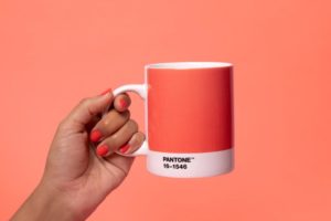

Pantone’s Living Coral
Pantone’s highly-anticipated color of the year pick is here, and it’s brighter and bolder than ever. Say hello, to Living Coral (16-1546)! An animating shade of orange with a golden undertone, the color falls on the warmer end of the spectrum compared to last year’s pick, Ultra Violet.
Inspired by nature and symbolizing our innate need for optimism, Pantone’s pick is a reaction to the onslaught of digital technology increasingly embedding into daily life. Pantone says Living Coral represents the pursuit of authentic and immersive experiences that enable connection and intimacy. “Color is an equalizing lens through which we experience our natural and digital realities and this is particularly true for Living Coral,” says Leatrice Eiseman, executive director of the Pantone Color Institute. “With consumers craving human interaction and social connection, the humanizing and heartening qualities displayed by the convivial Pantone Living Coral hit a responsive chord.”
Benjamin Moore’s Metropolitan
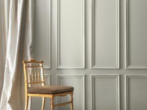
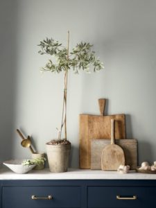
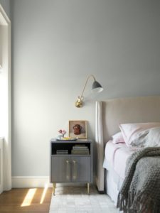
Last year, Benjamin Moore spiced things up with Caliente (AF-290), but this year, they’re toning things down quite a bit by naming the effortlessly sophisticated and oh-so-calming gray hue called Metropolitan (AF-690) their 2019 Color of the Year.
If you’re over the all-white-everything look but still want a calming, neutral canvas for your home, Metropolitan might just be what you’ve been looking for. “It’s a color in the neutral spectrum that references a contemplative state of mind and design,” Ellen O’Neill, director of strategic design intelligence at Benjamin Moore, describes. “Not arresting nor aggressive, this understated yet glamorous gray creates a soothing, impactful common ground.”
Where better to have a soothing color than in the bedroom? Benjamin Moore’s Metropolitan pairs well with ethereal neutrals, frothy pinks and rich blues and greens. Explore all 15 colors that pair well together in their full trend report.
Behr’s Blueprint
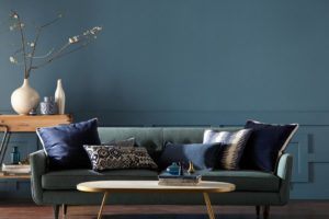
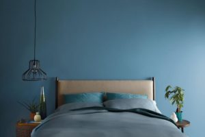
Sticking with a blue hue, Behr named Blueprint (S470-5) as their 2019 Color of the Year. Blueprint (S470-5) is a mid-tone blue that’s “warmer than denim and softer than navy.” Last year, Behr’s pick for 2018 was In the Moment (T18-15), a lighter blue with green and gray tones, evoking tranquility and mindfulness. This year’s deeper blue signifies “authenticity, confidence and timelessness.”
While Blueprint is a striking color, Erika Woelfel, vice president of color and creative services at Behr, explains the paint’s name suggests how the color can serve as a starting point for the design process for homeowners and apartment dwellers. “Much like the sketches builders rely on to bring an architectural design to life, Blueprint S470-5 lays a foundation for consumers to make their unique vision a reality,” Woelfel says. “This universally appealing hue provides a steady stream of positivity and is poised to be an instant classic for years to come.”
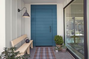
Even if you’re not feeling blue for an entire room, consider smaller areas of your home that could use a splash of this refined blue. We love the fresh take Blueprint gives to the classic blue-and-white color palette in this entryway. Behr also named 14 additional colors, categorized into four unique palettes, that work well with Blueprint in their full report of 2019 Color Trends.
Sherwin-Williams’ Cavern Clay
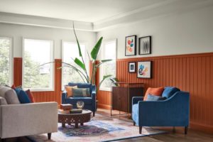
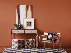
Sherwin-Williams forecasts warmer walls ahead for 2019, naming Cavern Clay (SW 7701) as their Color of the Year. The earthy terracotta color is on the opposite side of the spectrum from last year’s pick: Oceanside (SW 6496), a deep teal. Cavern Clay nods to midcentury modern style and the American Southwest, and materials like leather, simple woodgrains and indigenous cacti in contemporary, sleek gardening planters complement the color.
In line with the resurgence of 1970s style in design, Cavern Clay embodies the desert modern aesthetic. “We believe 2019 will be a renaissance of the 1970s — with a twist. In the coming year, we will embrace our pioneering spirits and artisan ingenuity,” says Sue Wadden, director of color marketing at Sherwin-Williams. “Our 2019 Color of the Year, Cavern Clay, embodies renewal, simplicity and free-spirited, bohemian flair.”
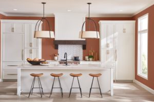
Sherwin-Williams’ Cavern Clay isn’t just for boho, desert-inspired spaces though. Paired with the right colors, it works as a timeless backdrop for a variety of styles like this contemporary kitchen. Sherwin-Williams suggests pairing with Cavern Clay with Moth Wing (SW 9174) or Dark Clove (SW 9183) for a more carefree, sophisticated look.


Leave a Reply